
spec • ux research • ui design
Creating a nutrition assistant app & responsive website
The Alimentor app and website is a project aimed to help its users achieve better nutrition through meal planning and nutrient tracking.
The focus is to better the lives of people who don’t know which nutrition programs to follow by offering data on the meals they consume, so they can be recommended what nutrients might be missing.
Project duration: January to February 2022.

Project overview
The problem
People usually have misconceptions regarding nutrition. There is a saturation of information with too many diets and programs to choose from, while there are also people with special diet requirements that feel restricted with their options. From the convenience of food delivery services to lack of education, the causes of improper nutrition are many, and the consequences wide and deep.
The goal
Design an app and a responsive website where users can plan their meals so that they learn what nutrients are incorporating to their bodies, in order to maintain a consistent measure of the Recommended Dietary Allowance (RDA). This approach allows us to avoid buying onto the numerous diet plans out there, which research shows can be subjective.
My role
UX designer designing the Alimentor app and responsive website from conception to hand-off delivery.
Responsibilities
• Conducting research
• Creating personas and user journeys
• Defining problem and hypothesis statements
• Conducting interviews
• Ideation processes
• Creating paper and digital wireframing
• Low and high-fidelity prototyping
• Competitive audit
• Conducting usability studies
• Accounting for accessibility
• Iterating on designs.
Understanding the user
Research & Insights
I conducted interviews and created empathy maps to understand the users I’m designing for and their needs.
A primary user group identified through research was people ages 25-50, who are often in charge of doing the shopping for home necessities and express an interest in their health and well-being.
This user group confirmed initial assumptions about Alimentor users, and research also revealed that they were looking not only for healthier meals but also to reach their daily nutritional requirements.
Pain points
Identifying good nutrition: Some users believe that good nutrition is achieved simply by eating healthy food, ignoring the amount of diversity needed in their diets.
Negligence and Education: Many people don’t care too much about nutrition and only eat what they enjoy, which can lead to a wide array of health disorders and conditions.
Time management: Not everyone knows how to properly plan their meals in order to get what they need for their good health. Nutrition apps tend to be overwhelming and bloat their experiences offering an excessive amount of features, from restrictive diets to calory counting and exercise.
Problem statement
Joseph is a 52-year-old convenience store owner who wants to customize his diet based on his current health and age because he is worried that his eating habits might not be right.
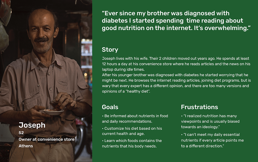
User journey map
Mapping Joseph's user journey unfolded many problems that can be solved by addressing the pain points of these tasks as improvement opportunities in a digital product.

Ideation
Competitive audit
An audit of a few competitors’ products provided direction on gaps and opportunities to address with the Alimentor app.

Crazy Eights exercise
I did a quick ideation exercise to come up with ideas for how to address gaps identified in the competitive audit. My focus was specifically on meal planning and nutrient tracking.

Home screen lo-fi digital wireframe
As the initial design phase continued, I made sure to base the home screen design on the relevant information that needed to be displayed as an established user, focusing the continuation of the design based on a user flow that starts at this point.

Low-fidelity interactive prototype
Using the home screen lo-fi digital wireframe as a starting point, I created a low-fidelity prototype. The primary user flow I connected was choosing or creating a meals plan, loading a meals plan, and completing the first meal to display the daily progress information.
Refining the design
Usability study
I conducted an unmoderated usability study to reveal insights for the main user flow. An affinity diagram was used to collect findings and prioritize them. Findings from this testing helped guide the designs from a low-fidelity prototype to high-fidelity mockups.

Insight prioritization
Project prioritization is integral in effectively managing themes from usability studies and thus discovering insights that can be categorized into priority tiers.
• Priority 0
Based on the theme that:
some users have trouble adding a date while creating meal plans,
an insight is:
the meals plan creation calendar interface must be revisited.
• Priority 1
Based on the theme that:
some users need more options for meal planning,
an insight is:
the menu system on the Plan section could be reworked.
Based on the theme that:
some users want to skip or replace meals on their current day meals plans
an insight is:
allow users to complete, replace, or skip a meal, as well as log off-plan meals.
• Priority 2
Based on the theme that:
some users don’t understand the nutrition graphs on the home screen
an insight is:
redesign the nutritional values to make them easy to understand visually.

In early designs, while on the home screen, the progress bars for calories and micronutrients only displayed a general percentage.
A toggle button was added to expand on more detailed information on each micronutrient.

In early designs, on the My Meals Plans, the only option was to select and load an already created meals plan.
The new iteration allows the user to select a meals plan and either see its content, load it to the current day or a specific one on the calendar, or edit it.

In early designs, while creating a new multi-day Meal Plan, the user had to remember what the specific content of the daily meal plan was.
On a further iteration, the user can see details about the plan, and also edit it to save it as a different plan.
Key mockups

High-fidelity interactive prototype
The high-fidelity prototype followed the same user flow as the low-fidelity prototype, including design changes made after the usability study.
Responsive website
design
The designs for screen size variation included mobile, tablet, and desktop. I optimized the designs to fit the specific user needs of each device and screen size.
Because the web has a higher focus on finding information I included articles related to nutrition in order for users to receive nutrition tips and to keep them informed.
The navigation bar was moved to the top to fit common web design standards.


