top of page


Xana Med
Logo

Xana Med
Business cards
Xana Med
Stationery

Xana Med
Website

Xana Med
Wall logo

Xana Med
Wall logo
Xana Med
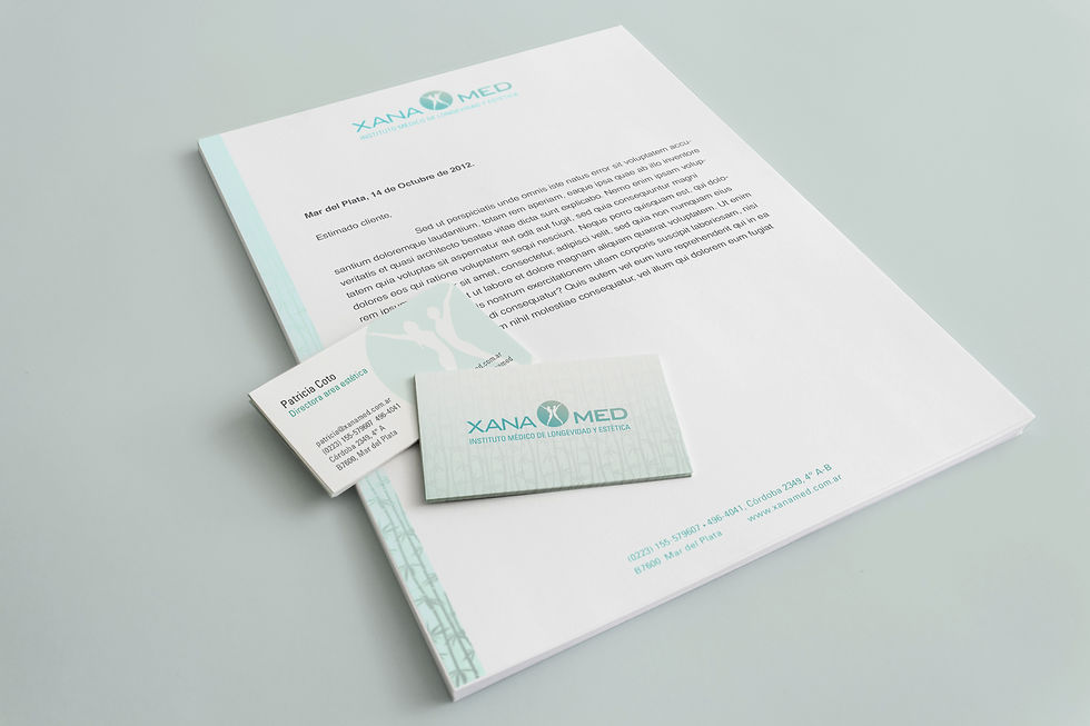
For this institute, the combination of medicine, beauty, and well-being is to be reflected on their identity. Xana Med has a strong sound on the starting ‘X’ and it was kept in mind as a resource.
The target audience is male and female, and since there is less association of men for this field of work, it was used as a resource as well. The logo showcases a woman and a man, expanding their bodies, expressing well-being. The final shape has them forming finally the ‘X'.
bottom of page